Dateline: Yesterday
Location: Actually, nowhere to be found
Headline (again): UFC Unveils New Brand Identity – fails
I get an Email today from the UFC Press Folks. These happen often, as one might guess. It’s a *gasp* press release. I wasn’t totally sure what it was saying at first, as initially I read it while navigating Chicago traffic. Luckily, I was able to avoid a cop seeing me serious accident. I’ll quote the relevant parts because, seriously, you’d have to be a hack to just throw the whole thing up as is. That’s – no joke – something I think is taught on the first day of journalism school.
“UFC’s new visual identity, designed in partnership with Hollywood-based branding and marketing agency Troika, celebrates the UFC position as an undeniable force in the world of sport. It further bringsto life the UFC brand attributes: premium, electric and lionhearted, while also elevating UFC athletes as larger-than-life heroes.”
No, I don’t know what the bloody hell that means either. It’s the most corporate speak of all time corporate speak. All it needed was the phrase Ideate. Let us continue, delving deeper:
With an increasing slate of content available across a wide range of platforms, design elements where heavily focused on providing navigational clarity and product differentiation for fans. The newly designed logo architecture and brand signatures, which include an ownable tab system utilized across all UFC properties, will be especially prominent in marketing and promotional materials serving to distinguish Pay-Per-View (PPV) events from broadcast and those exclusive to UFCFIGHTPASS.com.
OK. So, it kind of sounds like they’re going to have different logos for … everything they do? This is what part of the EMail looked liked:
Ah-ha! I think, there’s a link. I click this link and – no shit – this is what I see:
I laughed and laughed and swerved my car to and fro. I could barely contain my laughter, as I am a child.
Finally,I got to a computer and was able to open the accompanying PDF. HERE ARE ALL THE CHANGES!!!!
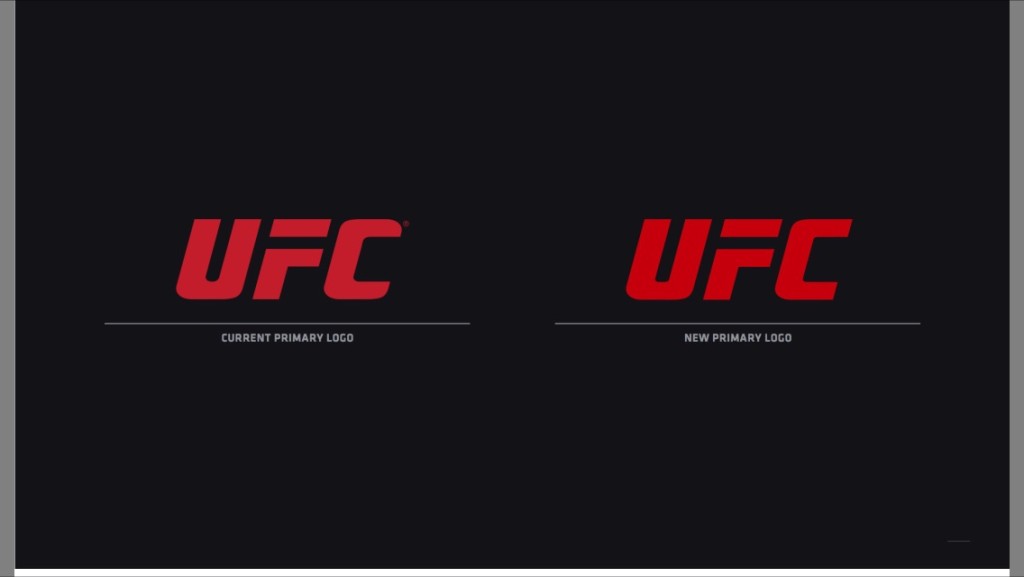
There’s more, where they basically take all the current logos they use for various show and have them all look exactly the same, just with different words.
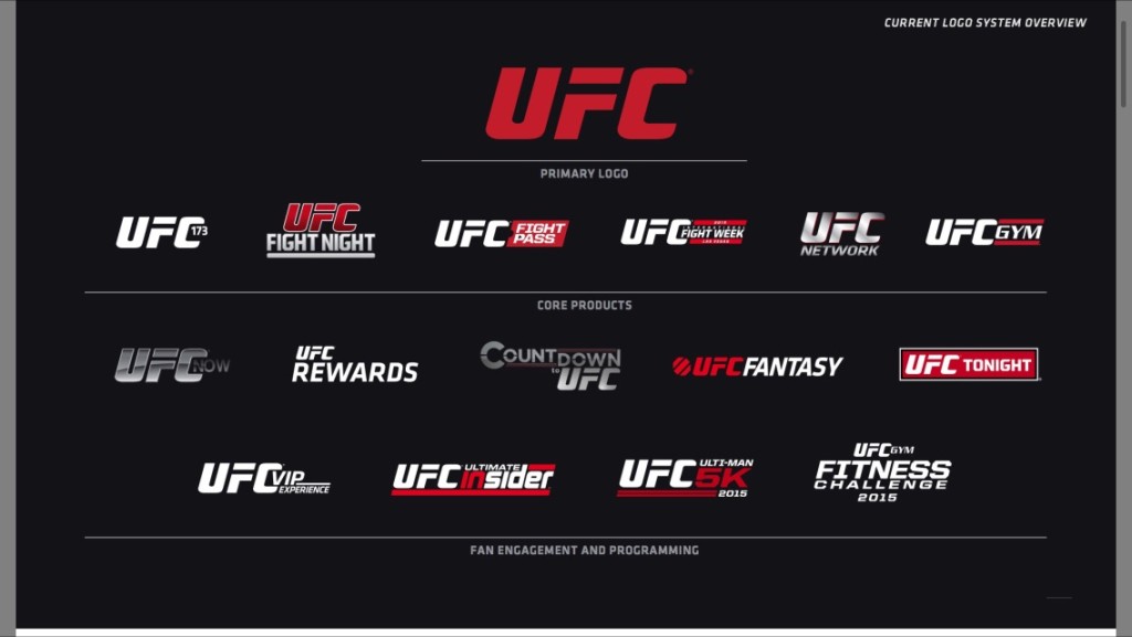
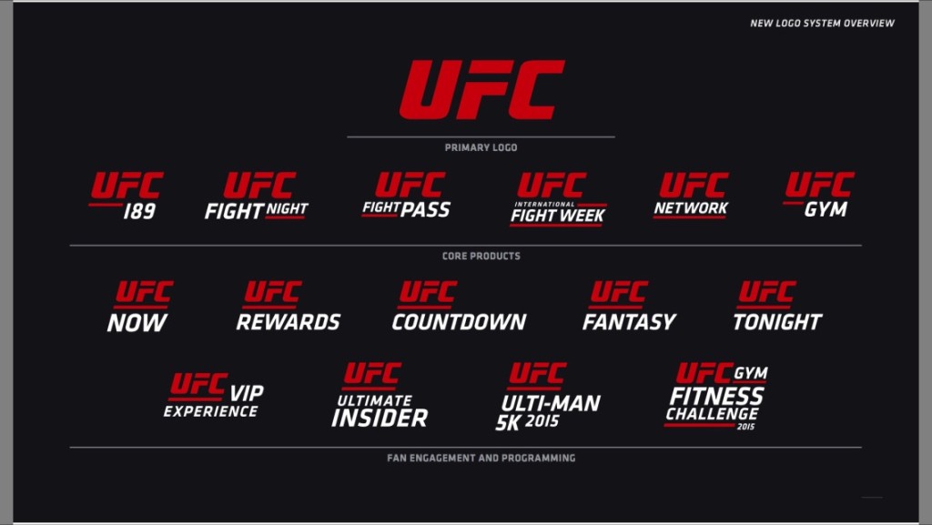
I don’t understand Mad Men at all.





Comments 1